Kum & Go
Campaign | Identity
OVERVIEW:
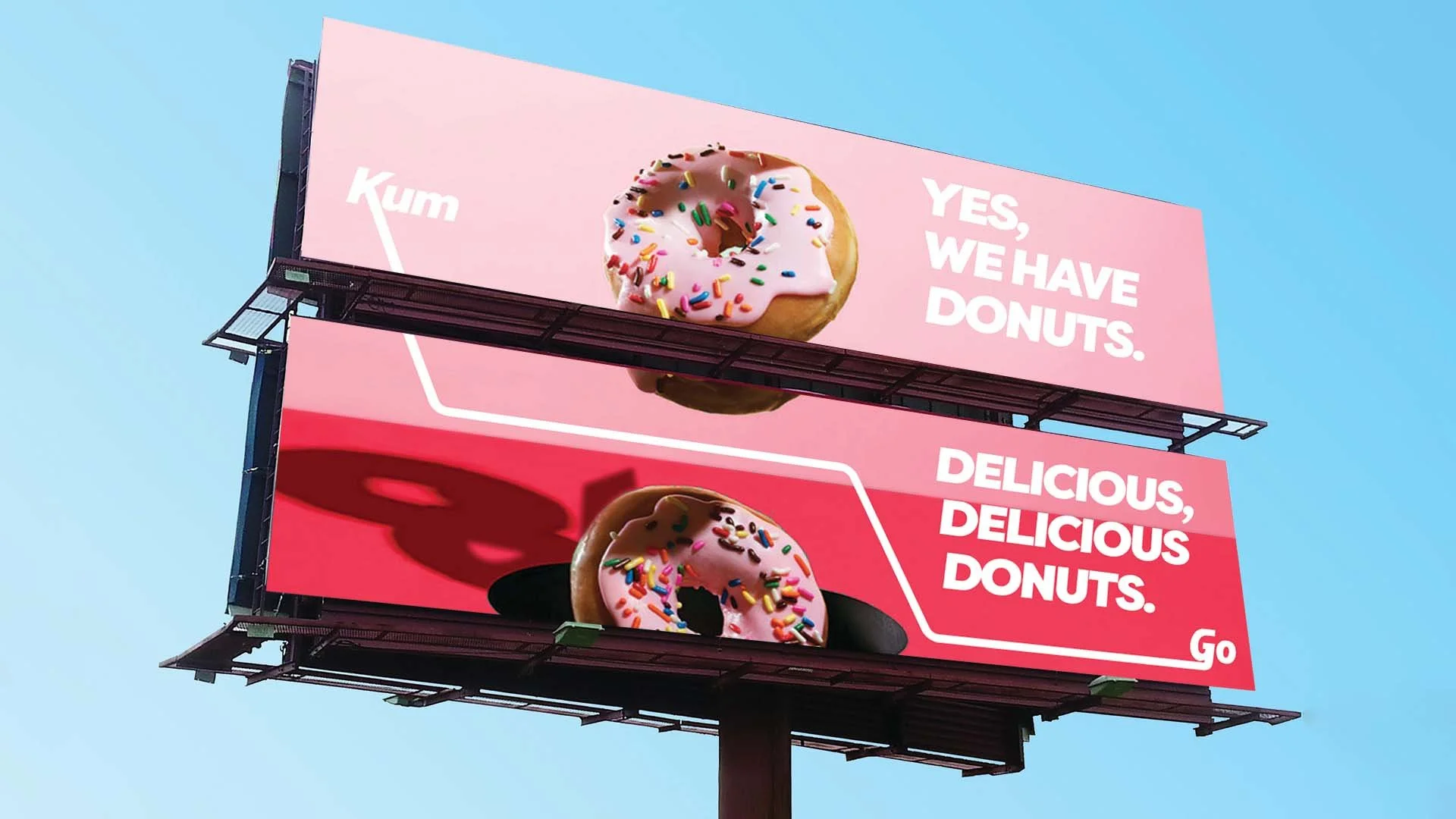
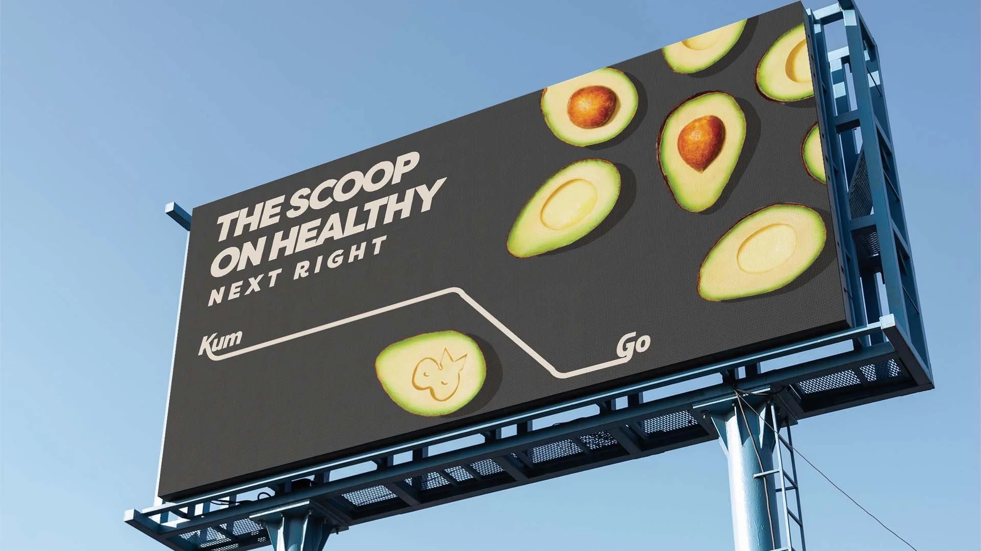
I was hired to help revitalize the Kum & Go brand, to give new focus and spotlighting to their move towards a more dynamic brand. We used the connector between the “K” in Kum and the “G” in Go to represent the path or journey a consumer could take. Kum & Go’s options range from healthy to decadent, and we wanted consumers to know they could choose anything!